The Heidi Lab initiative has run three cycles of agile analysis. Eighty highly data literate staff from 52 UK universities have taken part over the three cycles during the last year. The teams worked to determine widely applicable issues for resolution through data derived insights. Next they identified likely data sources for exploration. We added the data to our secure data processing environment and teams used different tools (mainly Tableau and Alteryx) to cleanse, link and explore the data producing interactive dashboards with a view to HESA and Jisc making the best available through the Heidi Plus dashboard delivery service. The initiative is proving to be hugely successful and we just announced release of the first suite of dashboards. We’re also recruiting new team members for January and April.
Jisc has just announced it’s co-design challenges and is actively consulting. They’re all interesting, but the one that caught my eye is titled ‘How can we use data to improve teaching and learning?‘
The Heidi Lab dashboard releases above include the ‘Destinations of Leavers in Higher Education (DLHE) Explorer’ and the
‘Multi-DLHE’. These provide ways of looking at the destinations data from the perspective of one institution compared with another. They offer a broad exploration of where students end up, looking at whether students have continued onto graduate study, found a job, gone onto study elsewhere or became unemployed. The team responsible for those tried mashing in NOMIS ((National Official Labour Market Statistics) data.
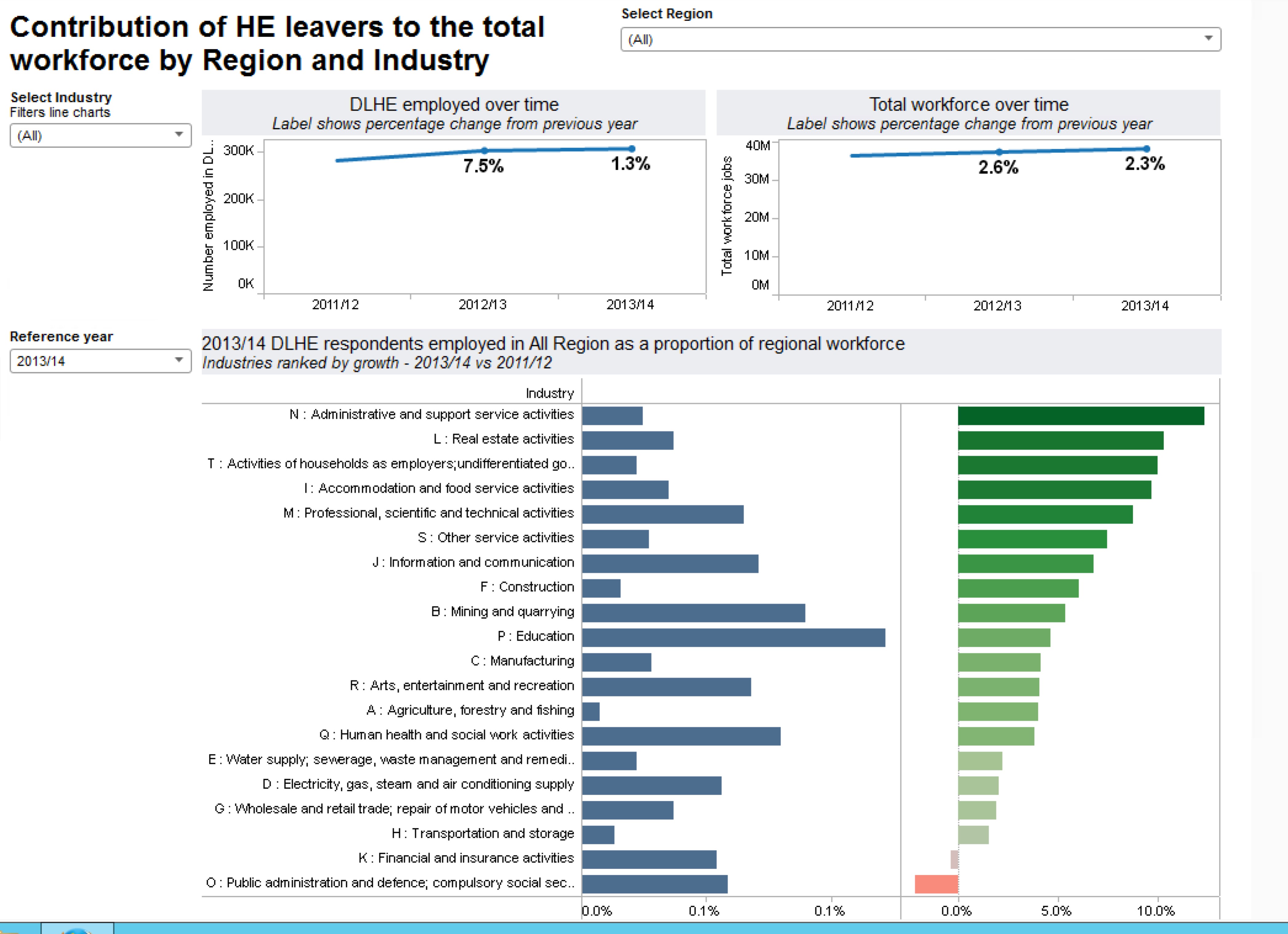
The combination of DLHE data and data from NOMIS makes it possible to see the relative trends between HE leavers and statistics about the workforce at a national level or regional level; by industry and by year. This is a great benchmarking tool for institutions, in combination with the previous dashboards, offering insights into their own leaver’s destinations and how they fit with National higher education and wider National employment picture. That’s a step towards insights to help us make a better Higher Education Curriculum in terms of employability.
What other data might we add to contribute to that co-design challenge? What other insights would help us improve the Higher Education curriculum?